Rich Dad is a financial education company started by Robert and Kim Kiyosaki. The company blew up overnight when Robert was invited onto The Oprah Winfrey Show in 2000 to discuss his 1997 book Rich Dad Poor Dad. I joined the team in 2008 and by that time Robert and Kim had managed to leverage the brand into much more than its book of origin. They had also managed to extend their brand so greatly, I felt they lost sight of their vision, mission, values, and even audience.
My challenge was to redefine the company’s brand identity, to evolve the brand’s voice, to unify the experience design, and to reestablish market relevance. The mission culminated into a company rebranding effort that span nearly 3 months and would eventually bring about a new brand strategy, identity solution, voice, and vigor. I spearheaded and shepherded the project end-to-end, helping the iconic brand remain pertinent and dominant. Attached are excerpts of that evolution and the resulting brand standards manual.
MY EPIPHANY
I had only worked there a short while, when I began realizing the company’s brand vacillated between marketing communications. The logos called out to me first. I found there were a handful of logotypes and logomarks in use at that time; versions of varied antiquity. Company designers, contractors, and partners were using different and outdated marks with very dated, very thick bezels, bevels, and drop shadows.

The styling of marketing materials was the next thing which landed on my radar. The look and feel of interfaces, products, emails, websites, events, signage, and other advertising pieces differed. There was no standardization in the visual theming across digital or traditional communications, let alone channels.
The interaction design varied, depending on the designers or developers of that project. It was apparent no holistic consideration was given to making the overarching experience similar across interactive environments or site components. A user would see differences in the same elements – from labels, icons, and static buttons, to button hover and pressed states, dropdowns, radio buttons, and animations.
I dug deeper. Even the voice of the marketing communication felt jumbled and indiscernible, with little in the way of an inherent brand value system or distinct tone being conveyed in the messaging. Aside from Kim Kiyosaki’s [Rich Woman] spin-off brand (which had a more distinguishable personality, audience, and advocacy than its parent), the Rich Dad brand seemed to have no consistency, to follow no logical pattern.
At that point, the company had no formal ideology in place to reign in the brand. No real understanding of its purpose, nor demographics. No defined targets. No strategy. As you can imagine, this created confusion for the customers and for the employees.
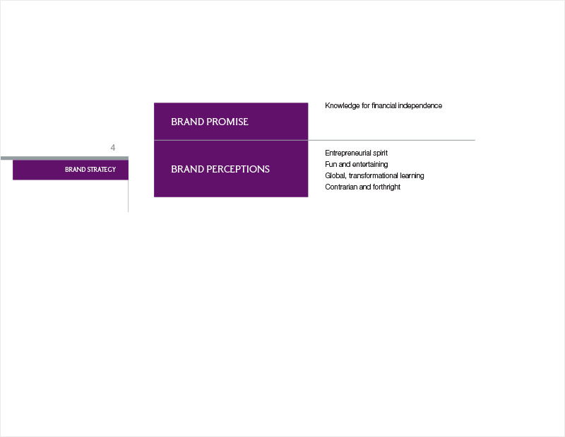
It became obvious to me the company would benefit greatly from a consistent user experience. In order to do this, we needed to figure out who we really were as a company, to whom we were speaking, and define our promise to those customers. We needed to create benchmarks for our performance, to better understand how we stood against the backdrop of competition in the market, and to find our strengths and weaknesses. Then, we could figure out how to standardize our message, to deliver it succinctly, and to build awareness. In other words, we needed to formalize a brand strategy in order to formulate a marketing strategy.
BRAND ANALYSIS
I brought this information to the executive team. I showcased the many discrepancies in our branding and marketing communication, asked several tough questions, and made a case to invest in a targeted strategy. After some perseverance, I received buy-in to begin in a brand overhaul.
At this point, we needed to start with a brand audit. We needed to benchmark what was and to create a framework for what was to come. Thus, began the process of baselining our current efforts and our performance, looking at the user information we had amassed, and looking toward the metrics we hoped to achieve. This included reviewing our analytics and re-engaging with our users to better identify Rich Dad’s audience (and how they perceived our brand). We discussed our strategic objectives and tried to set attainable goals.
WHAT WERE OUR USERS SAYING?
We studied the data of those curious about our world at a cursory level: prospects who supplied their contact information to receive email marketing. We worked to engage those users who had committed time and energy to the brand: fans who came to one of Robert’s book signings or attended a Cashflow Club game night. We also surveyed and interviewed paying customers of the brand: store purchasers, students from our educational (partner) courses, mentees from our coaching (partner) sessions, and worldwide event and seminar ticket purchasers. It was my interest to quantify our base and to qualify our advocates.
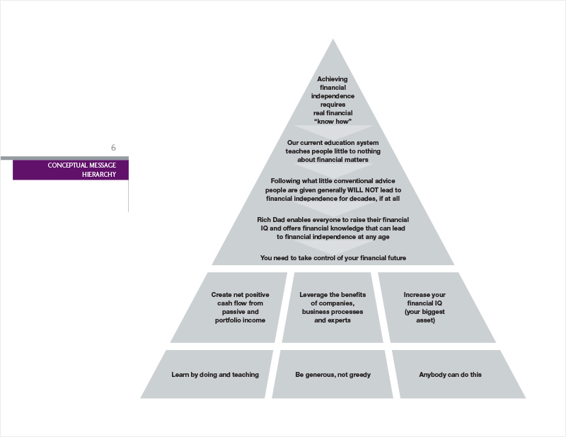
We studied past business performance, user behavior, and population data. We spoke to our power users, in order to learn from them and to understand why they became evangelists of the brand. These analytics helped us better pinpoint our demographics. From there, we looked at where we wanted to go…which customers we hoped to reach. This synthesis helped us to construct target profiles of our customers; and to retool and eventually retarget our efforts.
ROBERT GETS KENTUCKY FRIED
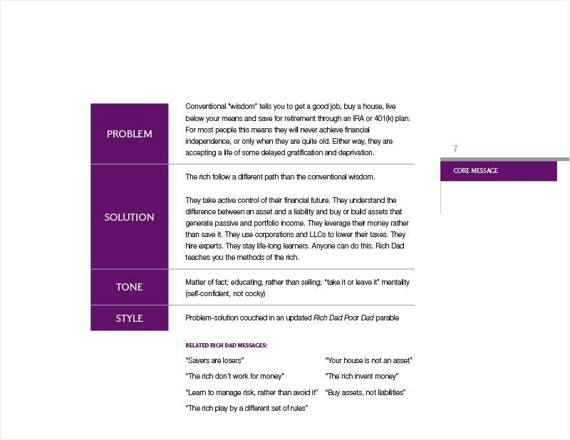
This exercise pointed us in the direction of Robert’s original messaging — the [Rich Dad, Poor Dad] doctrine that made him an overnight millionaire. It prompted us to comb through his teachings to find those foundational elements which hearkened back to the brand origins and built true brand disciples.
Robert was perceived a savage in 1997 when he first suggested, “Your house is not an asset” (rather, a liability). The real estate market was skyrocketing and experts lost their minds. …Then, the housing market crashed and people lost their homes. Suddenly, he was Nostradamus.
At that time, his views made Robert’s a controversial voice in the financial sector and one which stood out from the lemmings. Big and bold. Unafraid to challenge the status quo. Fast forward a decade and we wanted to ensure Robert’s voice remained forthright and contrarian…while also remaining contemporary.
Though, by this point in his sixties, we felt it necessary to reposition Robert (moreover, the brand voice) toward a slightly softer tone and one with a bit more refinement. It was time to transition the brand archetype from outlaw to sage. It was also time to give Robert and Kim their day-to-day lives back.
In the likeness of Colonel Sanders (the embodiment of the fried chicken empire) we wanted Robert on the bucket, but out of the store.

THE CORNERSTONE
Combing through our company ethos, and coupled with user engagement and research, we focused on what we felt was still the brand cornerstone: Robert’s CASHFLOW Quadrant. The Quadrant graphic represents the four ways people make money. Originally labeled with the acronym “ESBI” and marked with arrows, the diagram suggests an inherent flow between letters (as individuals zigzag their way from the Employees quadrant toward the Investors).

ESBI
- Employees: People who value job security, benefits, and a steady paycheck.
- Self-Employed or Small Business Owners: People who value independence and work for themselves. Also, those who cannot take time off without stopping making money.
- Big Businesses: People who have created systems to hire other Employees to work for them. Those who can take time off and still make money.
- Investors: People who don’t work for money. People who make their money work for them. Adept at using debt, taxes, insurance, and other opportunities these people make money passively through investments in assets.
The Quadrant’s importance to the brand can be felt through the years and seen through prior logo variations. The mark was the foundation upon which the brand was built and lent itself to the construction of our new brand promise. A promise retargeted toward a new customer, the modern investor, setting the expectation for what they could expect from us.
Now, with our updates to the brand foundations and core messaging taking shape, the look and feel would need rejuvenation as well. We felt the antiquated marks in use would do us a disservice. Looking at our logos, we needed the consumer to know our best days as a company were not behind us.
A CONTEMPORARY MESSAGE NEEDS VISUAL ACCOMPANIMENT
We kept the cornerstone intact, making The CASHFLOW Quadrant the core of our updated solution. Working to develop the strokes of the ESBI diagram into fills for a new logomark, we made the graphic more iconic in nature and with inherent motion built into its form. Admittedly, our earliest drafts felt a bit too close to the Windows (Vista) logo, so we made certain to steer the brand away from any obvious comparisons. We made decisions like rounding the corners, making the mark a uniform color, updating any waves into directional sweeps, and generally put forth our best efforts to create a unique emblem. We embellished the right column to weight the logo toward the two focal quadrants (Big Businesses and Investors). We also greatly debated changing the angle of The Quadrant’s horizontal dividing line, wondering if the curve should be aimed downward, left to right. Looking at the symbol we wanted to make it intuitive for our users they should be aiming for the bottom right (Investors) quadrant. Ultimately, we kept the legacy angle, as our team decided it was more important the Rich Dad symbol conveyed upward mobility upon first glance.
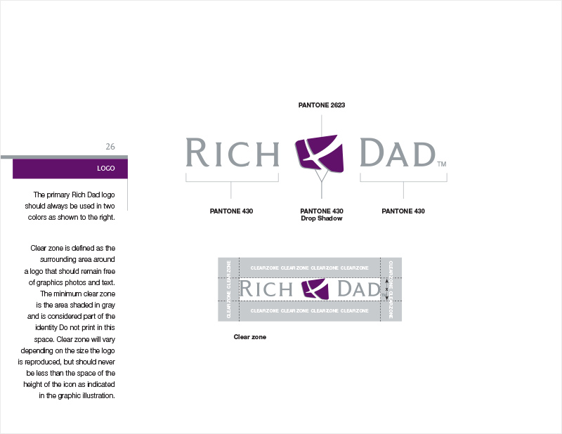
In addition to updating the 90’s color palette (once a Los Angeles Lakers throwback with a pinky-purple and yellow theme), we selected a new font family (Grant Avenue), and streamlined the drop shadow. Grant had what we felt was the readability and strength of a sans-serif font with a touch of the classic serif elegance. In all of our collective decisions, we wanted to make certain the new logo still evoked the old, and was visually similar enough to ensure brand continuity. For that reason, we preferred to carry some of the historic brand equity forward, choosing to morph – instead of replace – elements from the original. Another example of this is how we incorporated and finessed the logo’s drop shadow. Once backing the entire logotype, we chose to minify and to focus its use behind The Quadrant. Now a subtle embellishment (for use in high resolution and large scale printings only), the shadow was transformed into a tint effect. It was also relegated to the symbol (alone), as an anchoring effect between word forms (RICH & DAD) in our logotype.
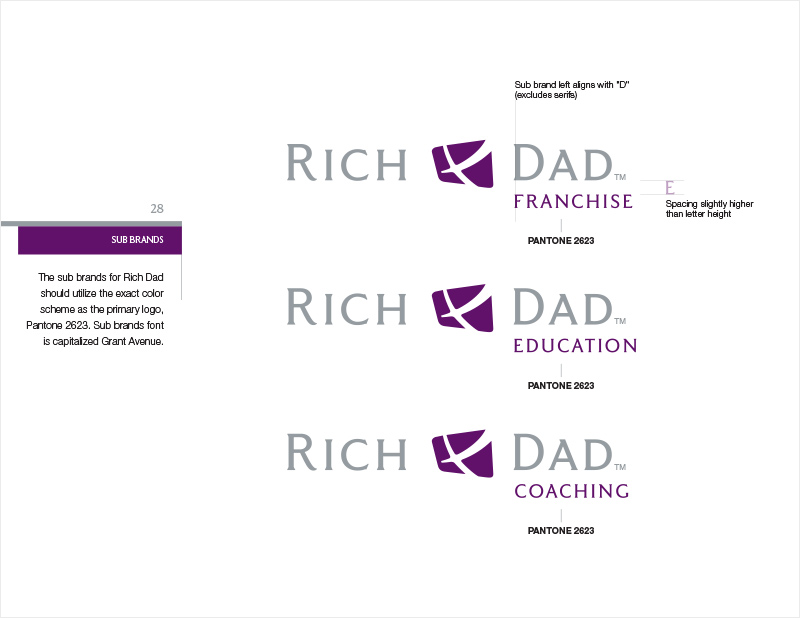
Once we locked the combination mark, we extrapolated this schema from the parent brand through the sub-brands. We worked to create a clear and unified lineage for the Rich Dad family of products and to bridge the old and new guards.
ONE SMALL STEP FOR KIM…
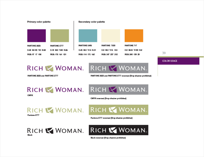
With this in mind, we took a few more liberties with transformation of the Rich Woman brand. While we felt it helped her to leverage the power of the main brand with visual continuity, Kim’s brand also needed to have some level of demarcation.
We aimed to create a distinction between Robert and Kim and their respective audiences (Rich Dad vs Rich Woman), but also to take a step forward from her original branding. The intent was to formulate a stronger identity than that of its predecessor, leaving behind the trite and overly feminine visage and the stereotypes of yesteryear (e.g. the cursive, the pink, and the fluff). This mindset continued into the messaging, with an emboldened, “gloves off” brand approach and voice, with colors and graphics to match.
Kim didn’t need to soften her approach for the stereotypical 50’s housewife. She was essentially working to educate, to embolden, and to target the same imprint as herself: the modern investor with money of her own, a wide open throttle, and an open road. Her purpose was to engender the female gender to take control of her own financial destiny and finally be free.

THE COMPETITION
In the reestablishment of our brand’s authenticity and audience, we were able to better clarify what we did well and what our customers wanted. Now, it was time to re-review what our competitors did well and to redefine our unique selling proposition. This would help distinguish us from everyone else in our market, and help us to attract and retain customers. We took a look at a number of the businesses and personalities in our sector; Among them financial brands: Yahoo! Finance, Dave Ramsey (radio host of The Dave Ramsey Show), T. Harv Eker (author of Secrets of the Millionaire Mind), Suze Orman (CNBC host of The Suze Orman Show). We even made certain to include feel good brands, like: Jack Canfield (author of The Success Principles & the Chicken Soup for The Soul series), Tony Robbins (motivational speaker & infomercialist), and Rhonda Byrne (author of The Secret).
It was important for us to understand our place in the market compared to our competition and to document our findings. This way, we could be able to validate (or invalidate) our efforts and to make future pivots in an educated capacity, based upon metrics.
A SELF-FULFILLING PROPHECY
To cement our team’s efforts over nearly 12 weeks, it was necessary to create a brand standards manual, including a graphic standard (style guide). This document would supply us with a true north, in order to guide our future principles and decisions. [It] would steer us internally, to shape our future actions, standardize our design efforts, systematize our marketing efforts. It would become a guardrail, in order to keep us on the path we had defined (until it was time to define a new path). The brand standard manual became our new de facto playbook: a document we circled back to with frequency over the course of the next year and through the course correction that followed.
As an outcome, Rich Dad remained meaningful and timely to an entirely new generation of financial education seekers. The brand strategy paved the way for a marketing strategy, which allowed Robert and Kim to continue to grow and to hone their empire in a purposeful and strategic manner. The rebranding helped them to grow the business with a more passive approach, no longer having to be a part the daily decisions. Robert and Kim got out of the office and onto the web, with podcasts and active social media accounts. They were able to enjoy their lives and take back some time for themselves, to enjoy the fruits of their multimillion dollar empire. Costs for redesign and lost opportunity went down. Follows, subscribers, email lists, and customers continued to grow. …Last I read, the Kiyosaki empire was worth an estimated $100 million.
Fundamentally, we allowed Robert and Kim the ability to move into that last quadrant — from Business owners to Investors — helping induce a self-fulfilling prophecy.
Suffice to say, there were much more arduous efforts given during each phase of the rebrand than is represented here. If you prefer to dive into the nitty-gritties of, say, font selection, check out this other post on my Attainia rebranding.
For an example of how we leveraged this new identity solution, take a peek at one of our many eventual brand extensions. A wildly successful product I developed for a new business vertical: the very first Rich Dad minted silver coin.
