Hired to replatform the company’s Software as a Service (SaaS) offering, I joined Attainia with their open invitation for a greenfield project (UX and UI) redesign. Before my time there, and for more than 3 years in the making, they had hired prior designers and whole design houses alike, but had been unable to release a tangible and viable product. Now, it would be my turn to help lead the charge. I would help the Design, Engineering, and Product teams rearchitect the SaaS solution (termed 3.0) from an umbrella perspective and figure out how to build out a design solution with successive modules that broke down the current 2.0 silos, for the company and for the clients.
One day, I hope to speak to the replatforming process at a deeper level. For now, the product has yet to be released (and so I’ll need to continue being hush-hush). What I can discuss, is the brand story that unfolded in the wake of those efforts. For, while I was in the midst of researching a much deeper understanding of our users’ personas and developing a more seamless approach for the software modules that would enhance their journeys through the new platform, I realized it was equally imperative for me to be investing my time in a better understanding of the brand itself.
BUY-IN FROM THE TOP
In addition to speaking with internal super users, department stakeholders, and the Attainian User Council, I met with members of the C-Suite and asked some pointed questions. In order to move the product forward I needed to know several things about the company:
– What was the company’s vision? …Did they build a mission statement?
– What did the Board of Directors see as the company “end-game”?
– What were the company’s values?
– How did the clients/marketplace perceive the brand?
– How did the company want its clients and the marketplace to perceive the brand?
– What was the overarching aim for 3.0?
– How would they sell it? …Was the focus on the platform or individual modules?
– Did they aim for a specific look and feel for their marketing materials?
– Did we have a standard definition for our main colors or fonts?
– Did we have a specific brand voice?
After much discussion and research, it became clear I needed to properly define the brand. I needed to create a formal Brand Standards document in order to unify the company, and to rally the employees behind it in order to rally the clients behind it. For, as Marty Neumeier says, “Your brand isn’t what you say it is. It’s what they say it is.”
I found a fellow UX designer had already begun piecemealing company information he had culled from various sources into a Word document. This was where I started. I combed through every asset I could find to inventory the current design and brand languages. There were a variety of languages in use [asset to asset], many with a unique theme, positioning, tone, voice, and look and feel: different logos, fonts, colors, and themes applied.
The web application looked different from the website, which looked different from the blog, which looked different from the forum, which looked different from the printed materials, which even looked different from the giant logo in the office entryway. It was so bad that employees were being allowed to design their own individual business cards!
Uniquely designed pieces seeming to represent uniquely different companies.
COLOR
We were a SaaS shop, so the RGB (web browser) color space had more relevance to the company than CMYK (printed colors). Still, in an attempt to normalize the color palette, I committed to a Pantone deck color study and honed a list of reds that I felt were indicative of the many reds I found in the company’s digital assets. The main hues in use vacillated considerably, ranging in a triad: from bright (pure) reds to muted orangey (tomato) reds to pinky (coral) reds.
Most employees verbalized the red to me like it was supposed to be a true (coca cola-esque) red, But, when I showed sample reds to my constituents — in printed Pantone chips and on newly calibrated monitor(s) — most felt reds with a touch of green (toward Ferrari red) best evoked the brand.
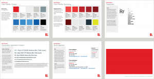
This led to the birth of my color selection, which we later termed Rosso Corsa (RGB: 225, 6, 0 / CMYK: 5, 100, 100, 1), in the likeness of a candy apple red and named after the international motor racing color of Italian race cars.
LOGO
There were a handful of company logos in play. Emblems, wordmarks, some with stroked outlines, some with no stroke, some with different kerning and tracking, and a variety of uniquely fashioned employee iterations (with add-ons of verbiage and dates for user software certification and the like). Though there were historical incarnations with Calibri, most of the main marks now featured some form of Helvetica.
In an attempt to unify the many instances, I chose to recreate [the mark] and to modernize the company font in the process. I ended up shifting from Helvetica toward Helvetica Neue Medium; A more refined version of its predecessor, optimized for larger copy blocks, for digital screens, and for readability at any size. This was, of course, when I had a mind to adopt the font for use companywide.
FONTS
As for the font usage, I found a hodgepodge of (mostly) san-serif abound in company materials. Thankfully, there were only a few egregious cases of serif. At the time, it was commonplace for an employee to develop a company asset in a vacuum: in support of their specific department for their specific project. That means an employee would find a font (they felt looked “close enough” to their vision of the brand) and roll with it. Of course, it also depended on whether that employee used a Mac or PC, and whether or not they were relegated to native computer fonts, freebies, and/or the (original) standard handful of web fonts.
This equated to digital and printed materials representing the company with a mishmash of Helvetica, Calibri, Arial, Tahoma, Futura, and Century Gothic fonts.
Since Helvetica was one of the elements most tied to company brand recognition, it was the cornerstone of my thinking. I originally considered using it in all company assets. This thinking quickly proved to be erroneous…
For starters, the cost to license Helvetica Neue is notable. In order to develop the variety of digital assets needed to support the company, I might need several styles with different weights and variants (plausibly a couple licenses for each style too, for print and web). The company would have to pay the literal cost for each. The company would also have to pay the virtual cost, for the server payload of asynchronously loading the fonts in the web app. Even after playing around with optimization settings and different webfont formats (e.g. EOT, TTF, WOFF, and WOFF2) our engineers felt the application would suffer from slower loading times. …Time to think about an open source web font.
Since we were a Google shop with G Suite at the center of our business (Gmail, Team Drive, Calendar, Docs, Sheets, Slides, etc.), it seemed obvious to me to consider Google fonts. I targeted the Roboto Family, their basic knockoff of Helvetica (originally developed for Android). This would allow me to get as close to my target font as possible, with much less overhead for our development teams and a better user experience for our customers. It would also aid in the globalization of the app (with use of a sister font, Noto) when the company offered multi-language support.
Everything was in its right place, until I got to email marketing and company communications. For, even though Roboto was a Google font and we used Gmail, custom font usage in email footers (for example) is still pretty archaic. Without the use of a separate (paid) service to control the look of an email signature design, you are relegated to basic web fonts. Even if you build the signature into an image file, sometimes that image doesn’t get to your intended recipient, or (if it does) is sent as an attachment. With company spam filters, this is no good.
This led to another quick [email] font study and the addition of a fallback system for graceful degradation of fonts for all email marketing and email footers. Of the available fonts, I believe Arial to be the closest to Helvetica (with Tahoma a close second). The character study was relatively neck and neck. The former beat out the latter in the end because of the font kerning, as the Tahoma words looked tighter than Arial words. Tahoma words took on a look closer to that of Univers or Roboto Condensed (more tightly coupled) and I felt the spirit of the intended font (and readability of paragraphs) was compromised.
So we landed on Helvetica Neue Medium > Roboto Regular > Arial.
WRAPPING IT ALL UP
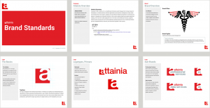
Knowing this would beget a living, breathing document, I tackled what I felt were the brand essentials. I defined a brand system, including a company purpose and mission, a succinct tagline (Healthcare Enterprise Asset Management), defined the culture and values the company [sought after/strived for], and the very pillars on which the brand stood. I created a formal Brand Standards document to serve as a singular playbook for internal and external communication and one which would allow for the development of a future design system (e.g. Brad Frost’s Atomic Design Methodology). …more on that later.
After creation of the guidelines, I hosted a companywide Brand Seminar. I wanted to rally the troops top-down and to unify the company behind the new standard. I also knew the formal guide would necessitate change management policies and new procedures to safeguard the brand. It was my aim to help employees embrace these changes. I wanted to teach the employees about protecting the brand, and how it would equate to strengthening customer loyalty, and – in turn – the company’s bottom line. Thankfully, it was easy to point out the many high profile and lucrative examples of brand value in the marketplace. From historical examples of million dollar purchases (like Berkshire Hathaway swallowing See’s Candies ) to today’s billion dollar examples (like Apple purchasing “Beats By Dre”, Disney acquiring Marvel, and AT&T merging with Time Warner).
On whole, the event was a sweeping success. Executives and employees alike were excited about the unveiling and were proud to back the new brand. It began a conversation about the importance of branding and brand equity (and why it mattered so greatly for the whole company to adopt and to champion the new standard set forth). Going forward, I had people come to me for clarity and even holes in the current standard, so we could begin filling in those gaps and to strengthening the guide. It was a groundswell that led to new business cards (story forthcoming!), marketing materials, website design, application design, and more. Most importantly, it led to the creation of a distinct and singular approach for the Attainia brand.
Here are snippets of the formal guideline I created…


1 Pingback