The City of Peoria, Arizona felt it was time to update their website. A city whose core values are based in part upon being innovative (the I in their acronymous P.E.O.R.I.A.), they felt the website was visually outdated and needed to be better organized to support the city’s growing user base.
After much deliberation and many years in the making, Peoria designed and officially unveiled a new city flag. They were looking to use that symbol, its theme (rooted in the “past, present, and future”), and its color scheme for the foundation of a new visual brand and the creation of a city style guide.
The website users vary between residents (general information seekers and those who need city services), visitors (driven largely by baseball spring training and Lake Pleasant), and businesses (business owners and future investors). The demographic was also heavily divided between a new generation of users who were tech savvy and those who were not.
With these elements in mind, the Peoria Communications Dept. asked me to submit a proposed redesign for the city homepage.
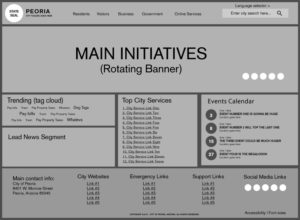
I started by educating myself on the national award winners for best city website from 2016 and 2015 and by refreshing my brain on 508 & ADA Compliance (support for Federal accessibility standards and the Americans with Disabilities Act). From there, I leveraged the similarities in the website winners and culled a list of site must-haves, fleshing out an organizational wireframe.
My shortlist minimally included a prominent site-wide search function, a main navigation that spoke to the divided user base (including a Services link for those seeking general information and an Online Services link for those needing immediate action), accessibility options for the impaired, a list of the top city services, trending information, an events calendar, and a reduced and reorganized footer (with improved city contact information and the addition of Emergency Links and Support sections).
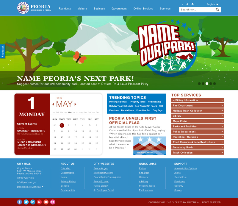
With the rough draft in place, I started to beautify my sketch. I designed my mockup based on the colors of the new flag (which proved to be tricky with its muted tones and saturation). I wanted to make the site feel modern (using a san-serif font for much of my low-level headers and body copy) while still bringing connectivity to the city’s rich history and current city seal (choosing a serif font for my main headers). I attempted to address user needs, searchability, city initiatives, accessibility options, the general notion of the “fold” (with respect per device), and what I had hoped was a very obvious path in the design for transition to mobile.
Here is where my proposal landed (see above)…

